Scry
Daia Elsalaymeh, Dania Azhari, Kevin Tsao, Nathan Tisdale-Dollah
Some standard info about our design:
-
We tried to keep most of our interfaces very simple and minimalistic, with white text and use of whitespace. Our used font is a sans serif font.
-
We used icons of the same shape and size to represent our widgets and apps
-
On many of our apps, we have a resizing option. The way to resize is to press on the arrow on the bar on the left or right of the app. A minimized version of an app can become full-screen and vise-versa. Ideally, this would occur with just a swipe of the app to that direction, so this is meant to emulate that.
-
Similarly, with the bottom bar of apps, the arrows are meant to emulate a simple swipe across the apps, as it would have ideally been instead of a button press.
-
Pressing outside the app closes it.
-
Chosen icons get highlighted in white light.

Choosing a language is the first thing a user has to do, which is for the purpose of making it easy to do the rest of the process. Languages are presented in their language, as it is presumable the user can read their own language.

This is the screen once a user has chosen a language. The chosen language is highlighted and the arrow turns blue, indicating a user can now proceed.
This is the screen once a user has chosen a language. The chosen language is highlighted and the arrow turns blue, indicating a user can now proceed.

The mirror's features function optimally with the use of wi-fi, which is why the user is given the choice to connect to it early on.
The mirror can still, however, function without wi-fi, so they can choose to skip this step.
Otherwise, users can use a keyboard to enter passwords and a scroll bar to scroll through available wifi.

This is the screen once a user has chosen their wifi.. The chosen wifi is checked and the arrow turns blue, indicating a user can now proceed.

This is the screen for the user to choose the date/time. They can input it manually with the number pad or just use location services if connect to wifi, which will fill it automatically.
Filling it in manually will automatically take you to the next field, so you do not have to reach to switch between fields.

This is the screen once a user has chosen a language. The chosen language is highlighted and the arrow turns blue, indicating a user can now proceed.

This is the screen once a user has chosen a language. The chosen language is highlighted and the arrow turns blue, indicating a user can now proceed.

This is the screen once a user has chosen a language. The chosen language is highlighted and the arrow turns blue, indicating a user can now proceed.

This is the guest screen.
The text on the top is all read-only.
On the bottom, there is a button at the left to turn the mirror on and off, and on the right, there is a button to create a new account (with the same choose-a-swipe process).
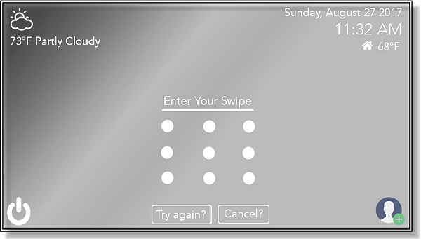
When the user turns a mirror on to log in, they must enter their swipe they created beforehand.
"Try again" button is to clear away the swipe to start anew.
"Cancel" is to clear away this entering-your-password interface.

An example of an incorrect password. Choice to try again or cancel.

This is the minimized version of the utilities screen. The user chooses what information they want to see, which will become highlighted, and they will see that data in a graph format with some additional info below it.
The tabs are located on the bottom for easy reach and are represented with simple icons.
The current day is highlighted.

The full-screen version of above, with all three utilities shown at once.

This is the screen for the user to control the light around the mirror.
They can choose from the provided colors as their light color and control the brightness along a spectrum.

This is the minimized version of the calendar app. The calendar is on top with the daily tasks just below it for the highlighted day (I had forgotten to highlight it, but the user would choose this day. It defaults to the current day).
If there are a lot tasks, the user can scroll through them.

This is full-screen version of the calendar app.

This is an example of a third-party-app. That company would make their own app for the mirror, so they will change their formats based on that. This is the minimized version of a facebook app.

This is the full-screen version of that app.

The weather application displays the current weather, as well as the weather over the course of the week alongside the highs and lows for those days. The application can be full sized in the middle of the screen, or moved to the left or right side in a smaller viewing format.

This is the full version of the weather application.

This is the right side version of the weather application.

The app store is available to users as a way for them to install third party apps to their mirror. On the left hand side you have a preview of the application followed by the set of applications to choose from, on the right hand side you have a description of the currently selected application, followed by a search bar with a keyboard to allow users to specifically find what they want without constantly swiping through.

The timer application allows users to set a time for any action that they would like to keep track of. The timer is set by a number pad underneath the timer.

The health app allows users to keep track of their weight, sleep schedule, and steps they have walked. This is displayed on the screen side by side when in full mode. When placed on the left or right hand side, the icons for each act as tabs for you to select in order to display the information you would prefer to see currently.

This is the full sized version.

This is the right side version of the health application.

The settings application allows users to alter the wi-fi network they are connected to, change the date and time, the sound level, and the language. The settings menu can be moved to the left side or the right side as well.

This is the right side version of the settings application.

The video application allows users to browse and play videos from youtube and videos stored on the mirror.

This is the full version of the video application.

This is the right side version of the video application.

This is the sticky notes application that allows the user to create and pin to any area of the mirror.

This is the drawing application that allows the user to the mirror as a canvas.
This is the background application that allows the user to display custom backgrounds on the sides of the mirror.